Troll Kingdom

This is a sample guest message. Register a free account today to become a member! Once signed in, you'll be able to participate on this site by adding your own topics and posts, as well as connect with other members through your own private inbox!

Wolverine

Mentalist

Administrator
Staff member
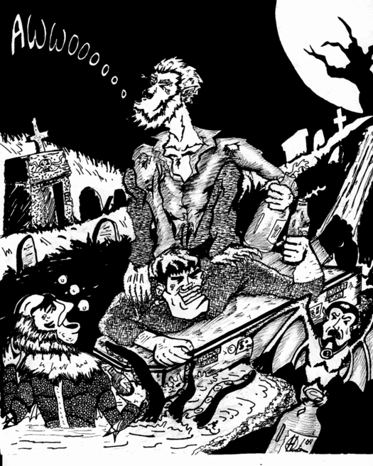
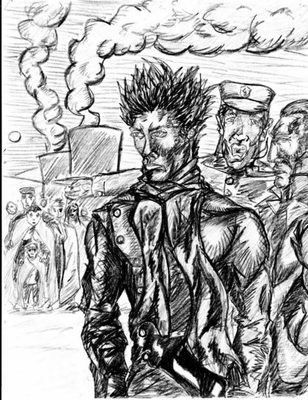
I Was messing about on this one. Trying new shit out. Using ink for a start. I was thinking of painting over it, I may still do. This is a rough drawing and heavily shadow laden which is always very difficult to get right. I was going to grab some paints and paint the detail onto the arm that's not shadowed and add dabs of light to bring the shape out more.

I probably won't bother..

Who knows...


untitled1copy6gd.jpg
 
Menty go post this over at the forum, it's perfect for this weeks challenge. I did a Man-wolf revamp.

Nice job. What I'd like to see is some sort of back ground work. The sooner you start on that, the more complete and composed your pictures will start getting. You'll see it makes a dramatic difference utilizing your negative space.

Also as it can be cumbersome, the sooner you get to it, the less headaches when you really get inspired to want to tell a story w/ your images.

Again, nice work, you're a natural at this.
 
Thanks Hunter. I will. this was my first attempt at inking something and I went a little crazy with the ink to detrimental effect, I think. I should of tried something with less shadows. I am working myself up to doing background work. I am doing a vista shot at the moment with a huge view that's taking up a long time.


I will post this over at the forum though, thanks for the tips, it's what I need to improve.
 
For example either on that drawing, or on a sheet of paper you can put ontop of it to where you can still see the image beneath it-try adding a horizon line in back of Wolvie. Even something so simple of a line can place the character in a setting.

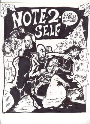
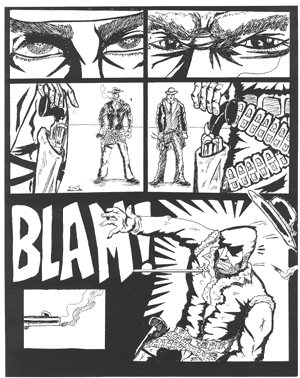
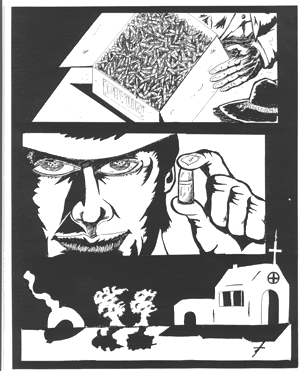
Here's a few examples of my own stuff. There's a lot of weak drawing here, and mistakes, but still i filled up most of the page, and made use of my negative space.

W/ the exception of the last one of the girl which still has all that open space in the back ground.


My bad for clogging up your thread btw, I'll post this and take it down in a bit..


Note2selfx-mascard.gif


wagesweb7.gif


wagesweb4.gif


mpdarkgrey.gif


aviatormonroe1.jpg


maryrough1.gif
 
^Smitty: thanks for the examples of what you mean by making use of negative space.

I meant to say before I like the dynamic energy in your work.
But I didn't. So I'm saying it now.

Not just Menty wants to learn stuff! :D

(which is grammatically odd, but ya get the gist)
 
You have awesome talent, Hunter. Really fucking cool stuff you have done. I'm definitley going to work upto filling pages up and making more complete drawings. I love it.
 
And yeah, I am working on my negative space as well. I am lucky to have a professional artist in the house. I quiz her all the time on how to do this or that. It's very helpful.
 
Mentalist said:
You have awesome talent, Hunter. Really fucking cool stuff you have done. I'm definitley going to work upto filling pages up and making more complete drawings. I love it.


Thanks man, maybe one day soon we can do a hip hop comic!
 
Top